FOFO BILALA.
FOFO BILALA.
Creative Campaigns
From brand direction to social media presence — creative content built around your product, your values, and your audience.
Creative campaigns developed for businesses, products and services that need a clear visual and advertising direction — especially when starting from an idea and turning it into a complete launch or promotional concept.
A campaign can bring together branding, logo development, colour palette and visual direction, commercial video, social media content and promotional design, creating a consistent visual experience across different touchpoints.
Ideal for new products, services and businesses preparing for launch, as well as existing brands looking for a fresh creative direction or a stronger way to present something new.
Every campaign below is an original creative concept designed to showcase my approach.
What if Fofo Bilala were a tech brand?
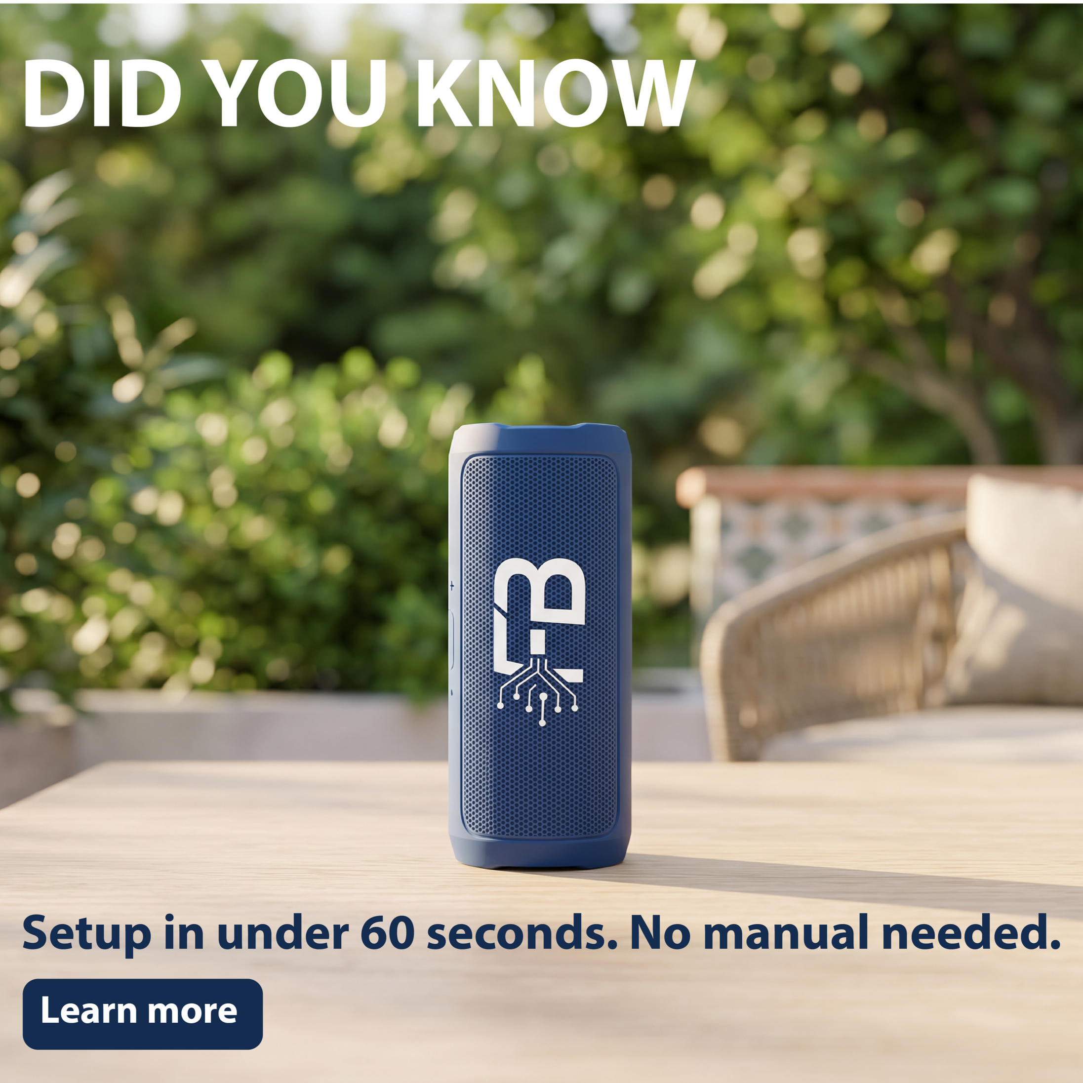
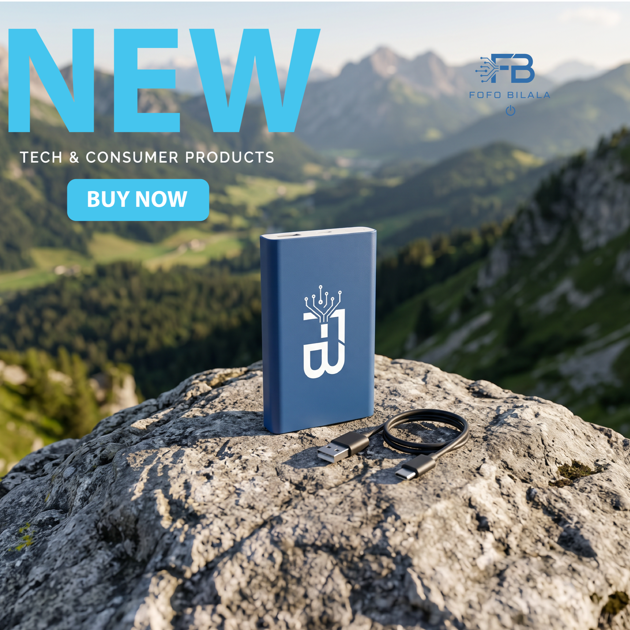
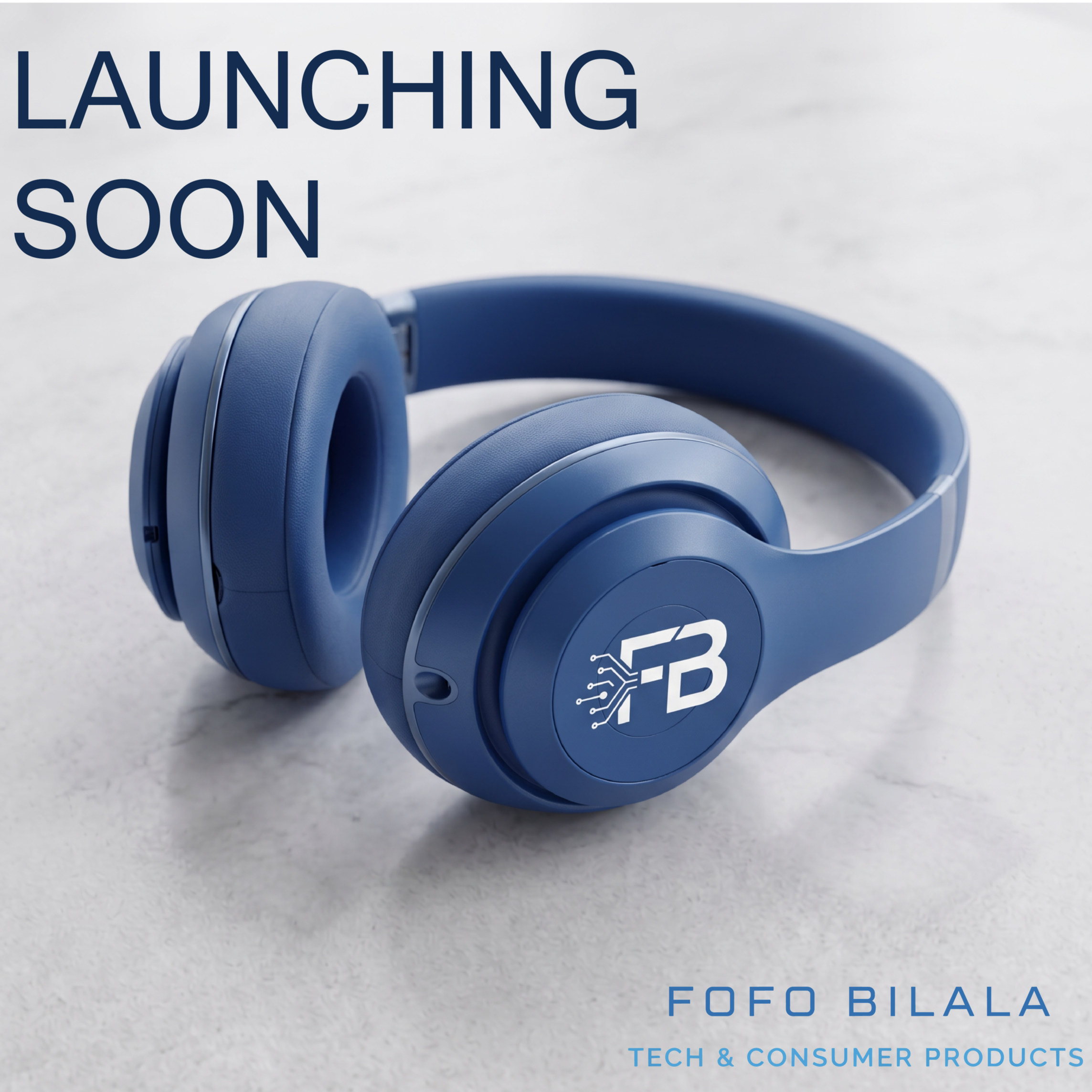
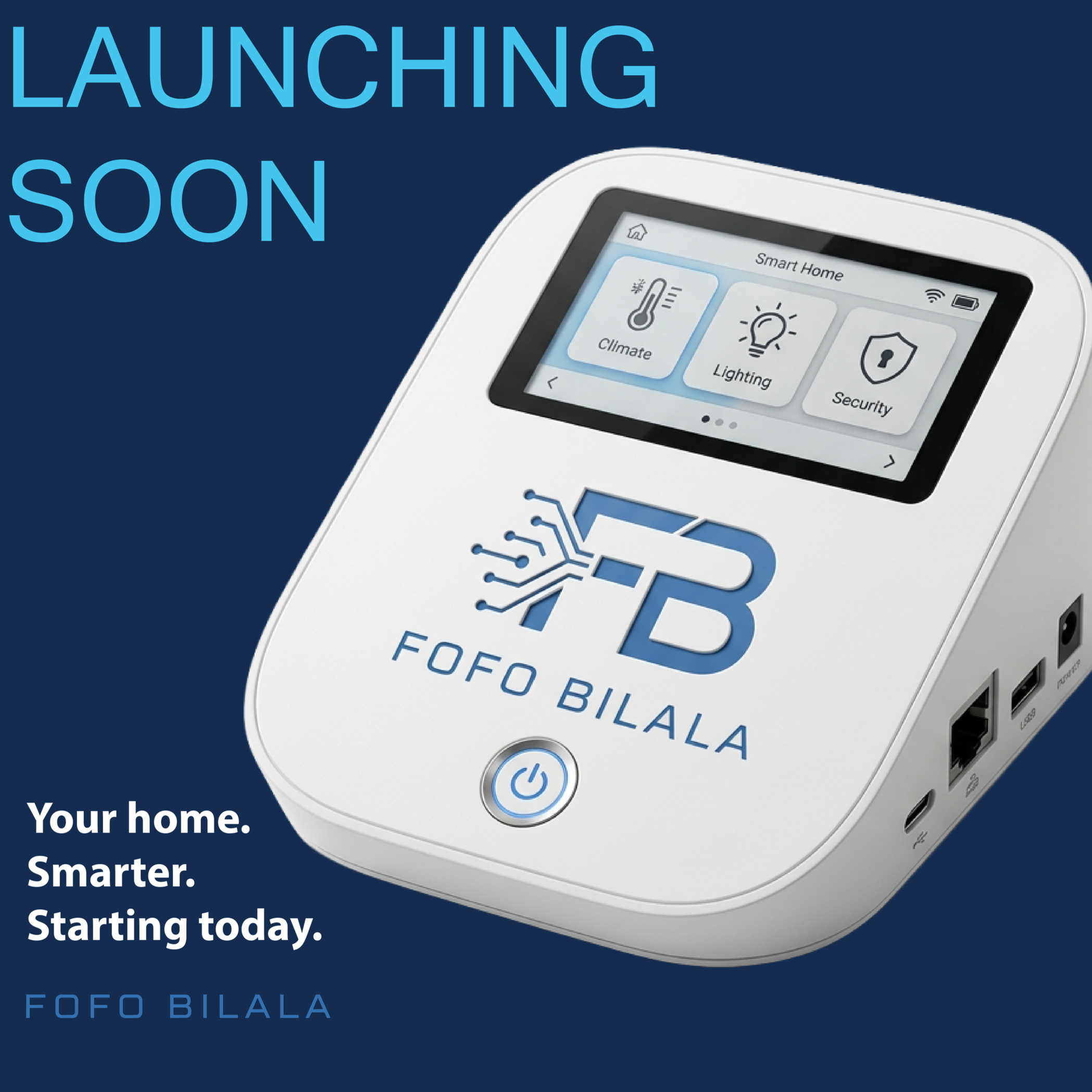
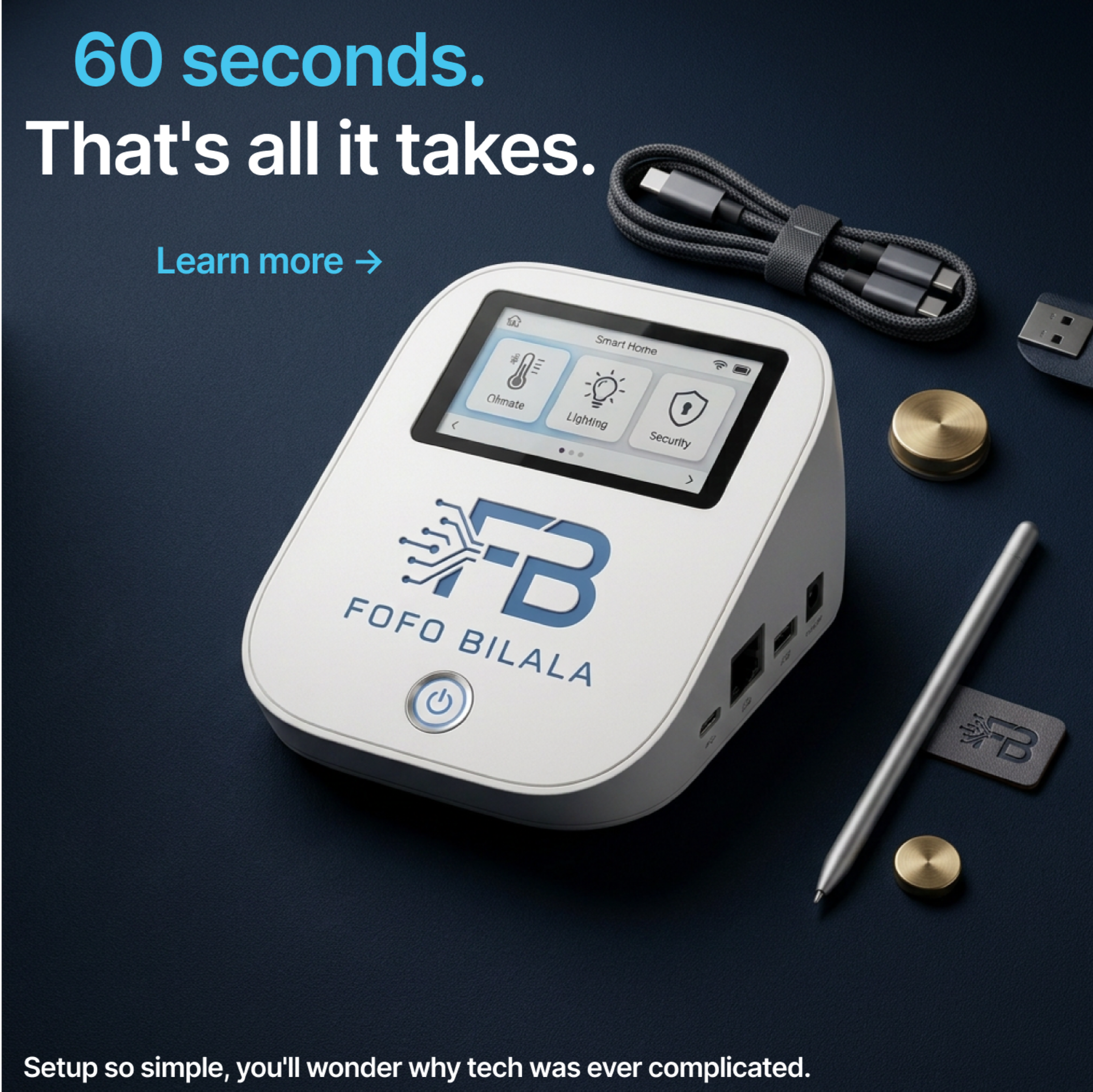
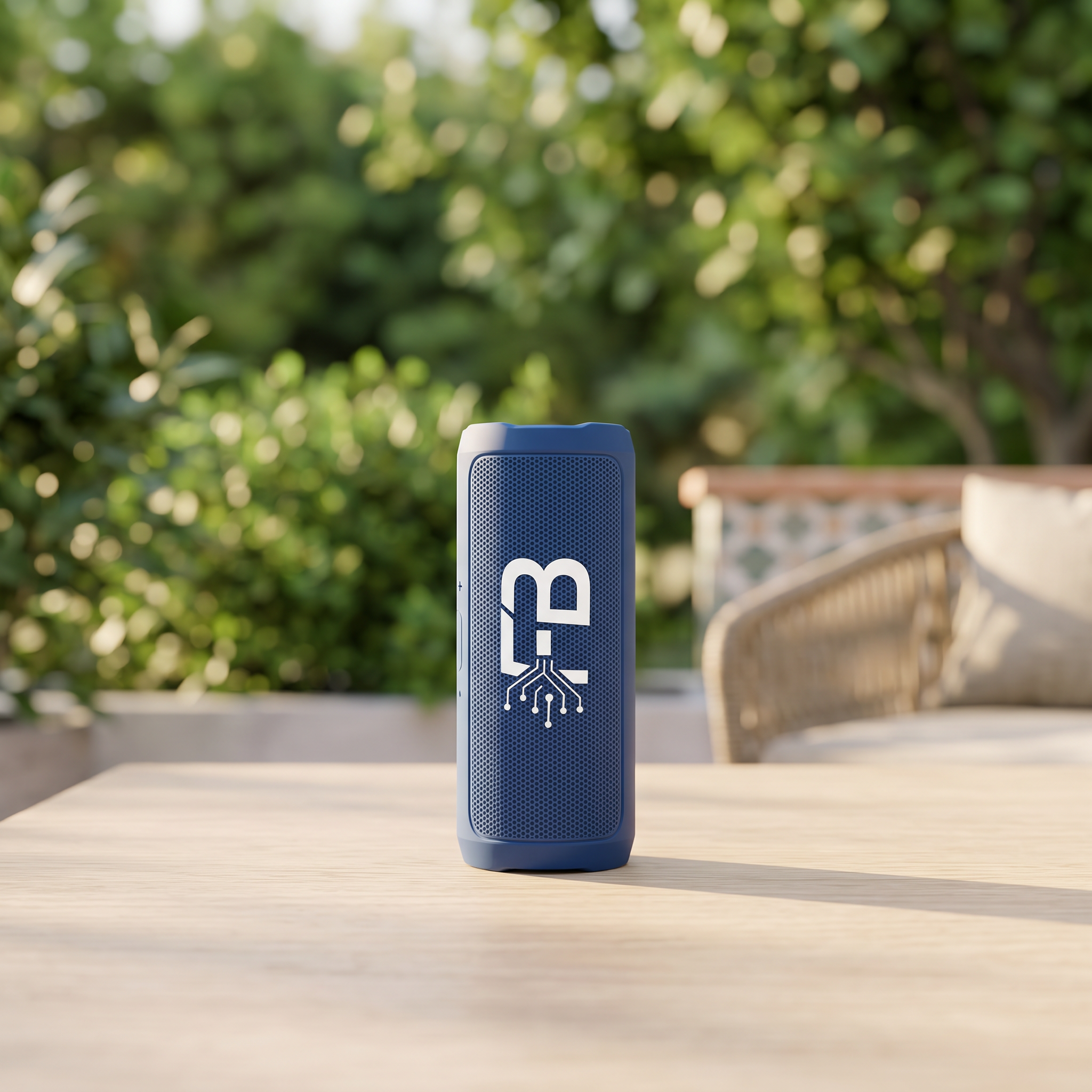
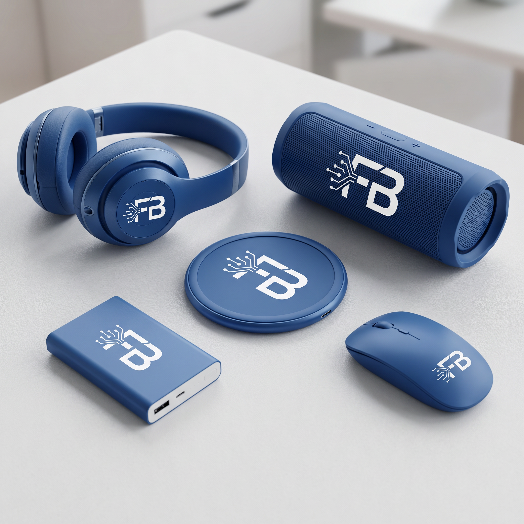
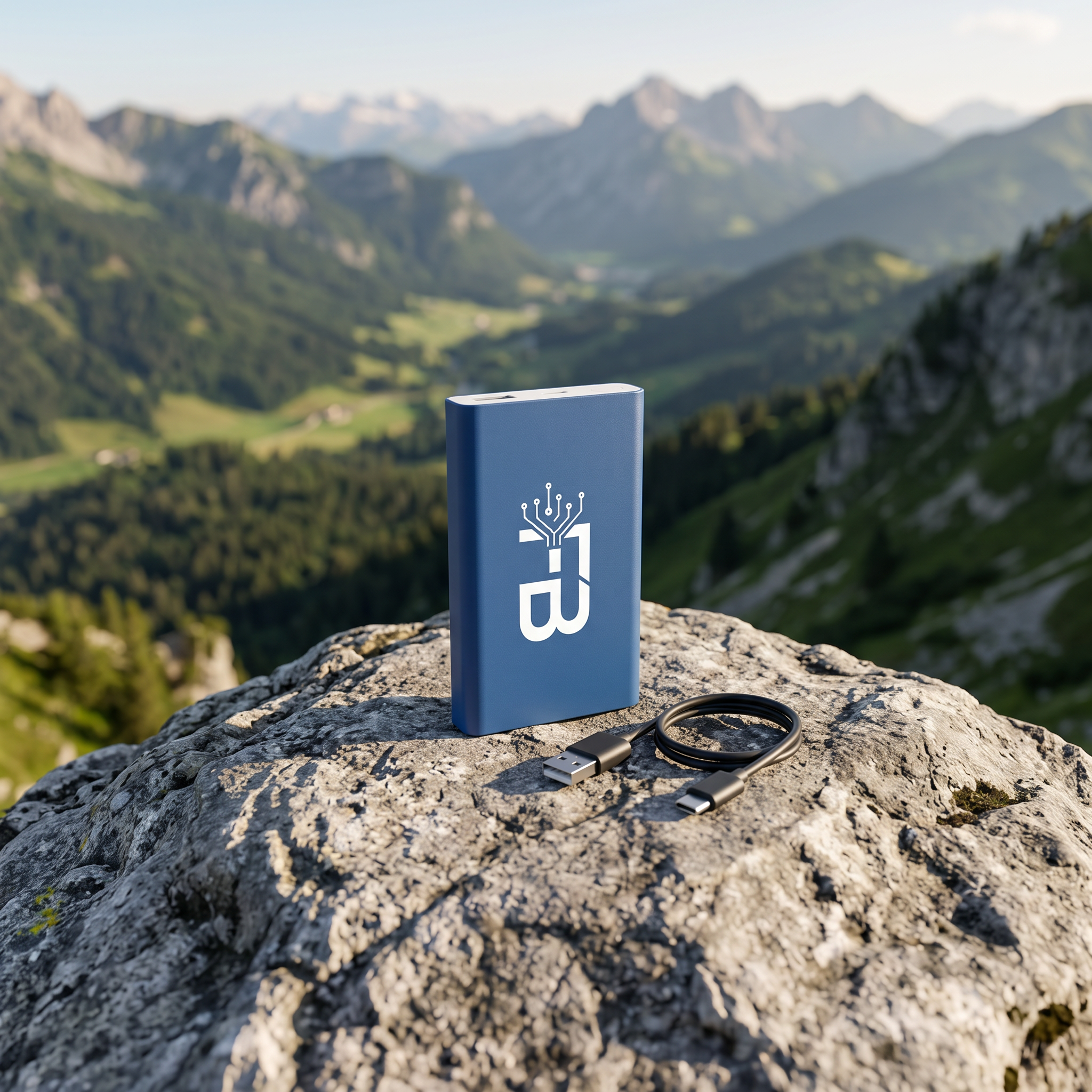
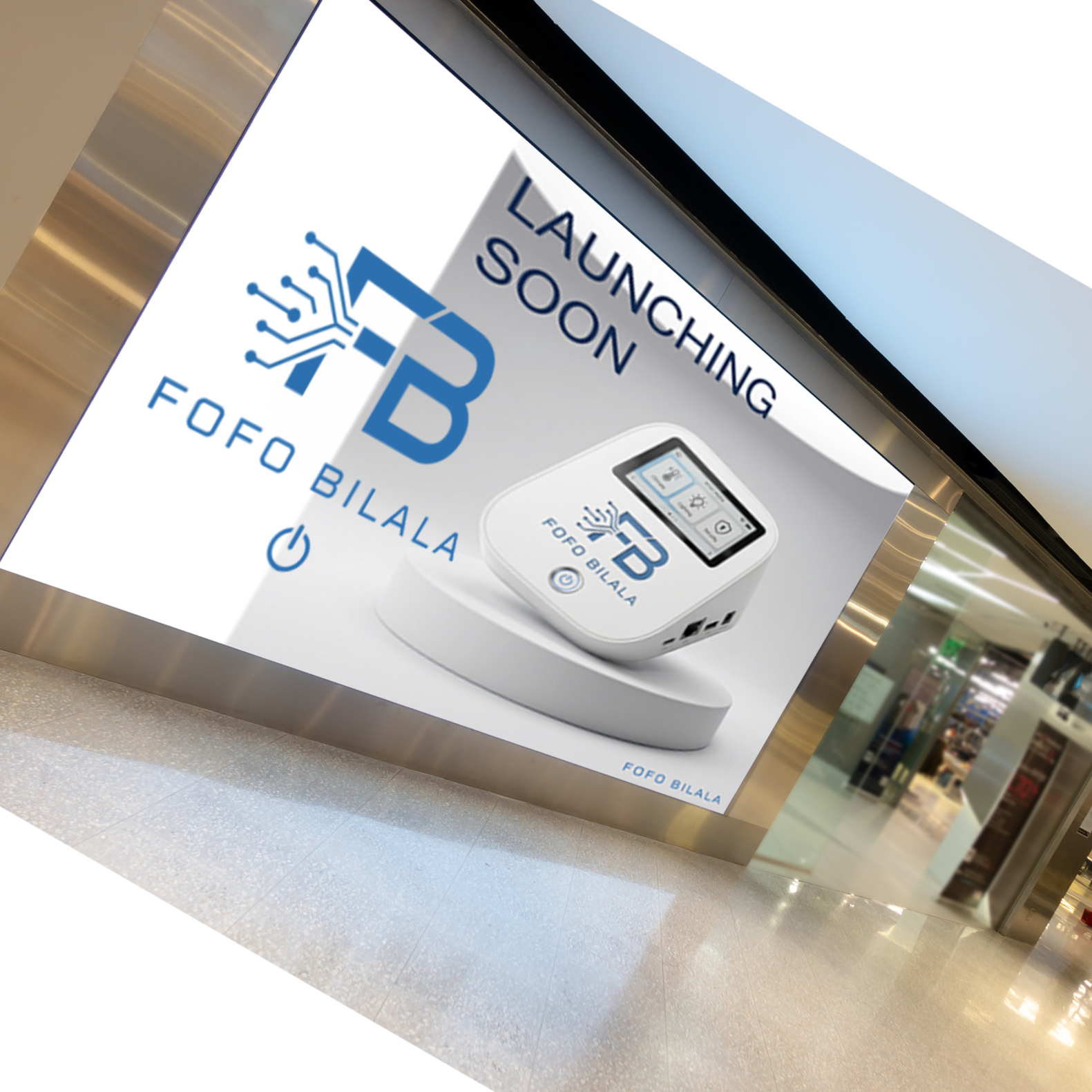
This is how a product launch would look — from brand identity to a complete social media campaign.
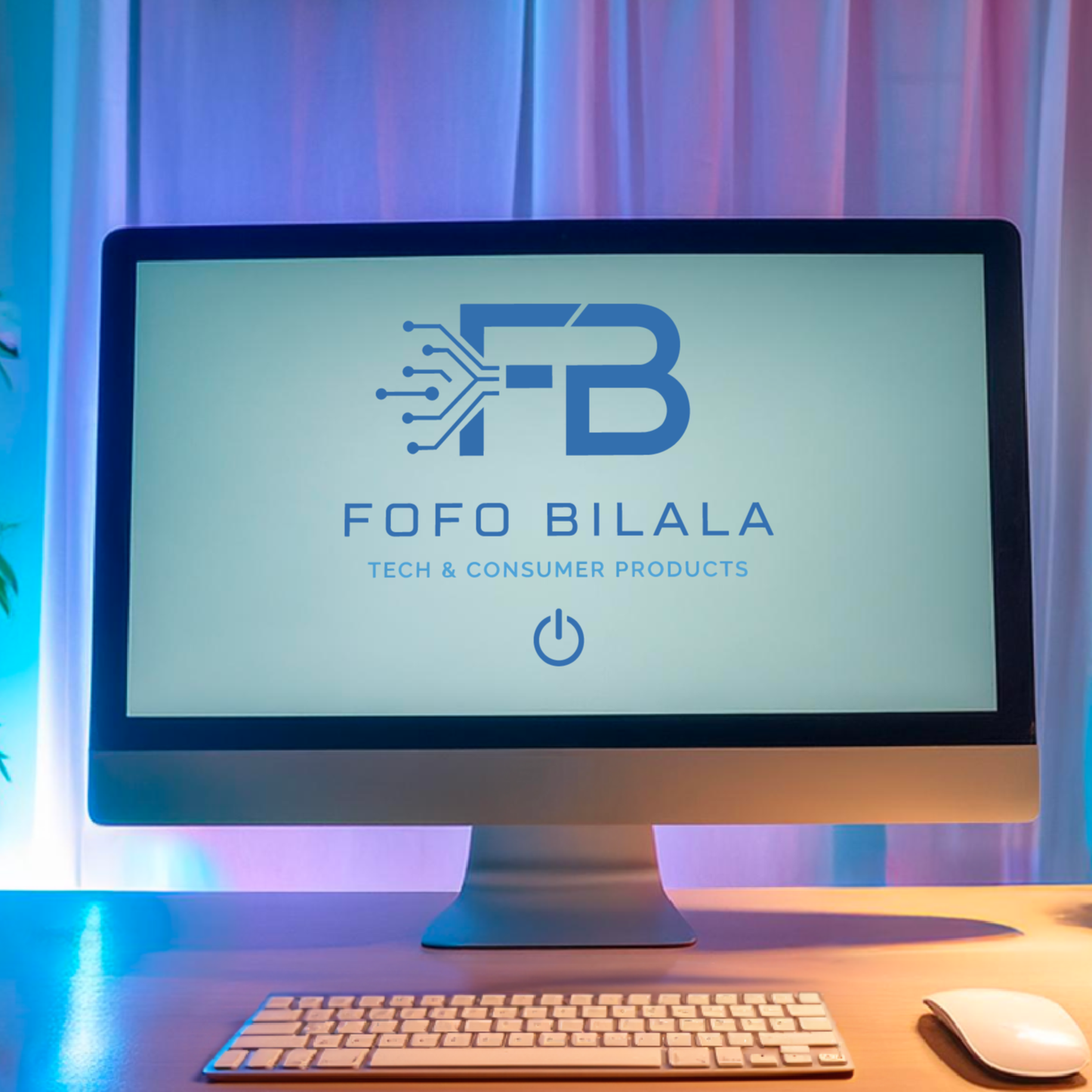
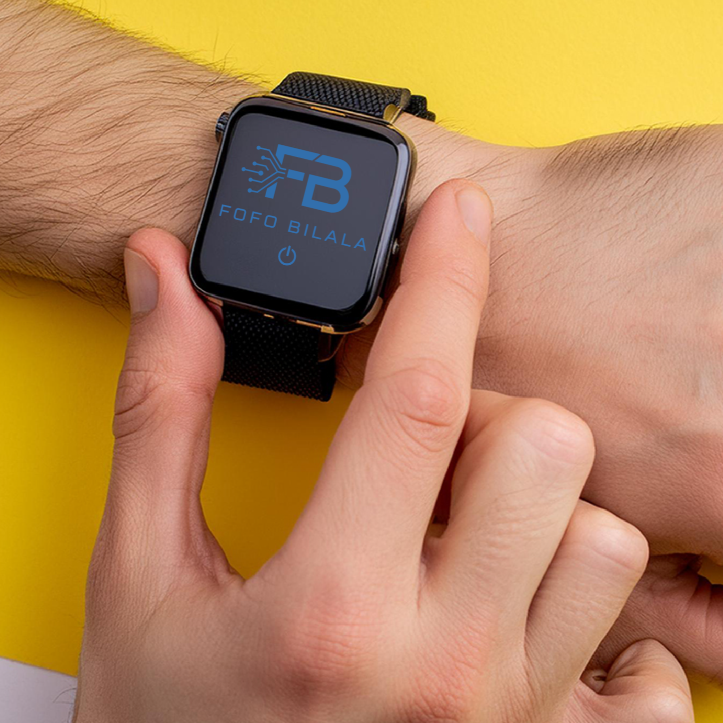
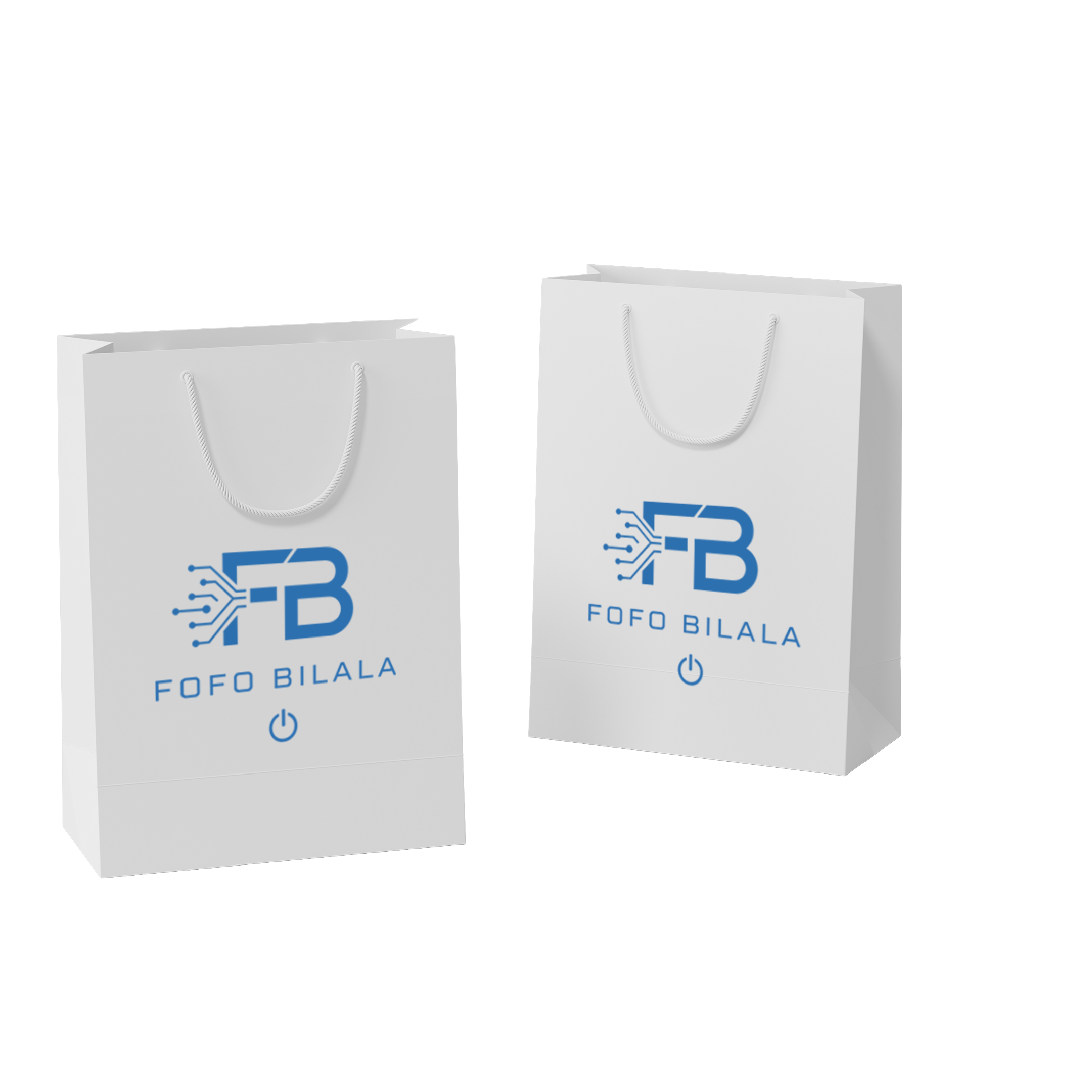
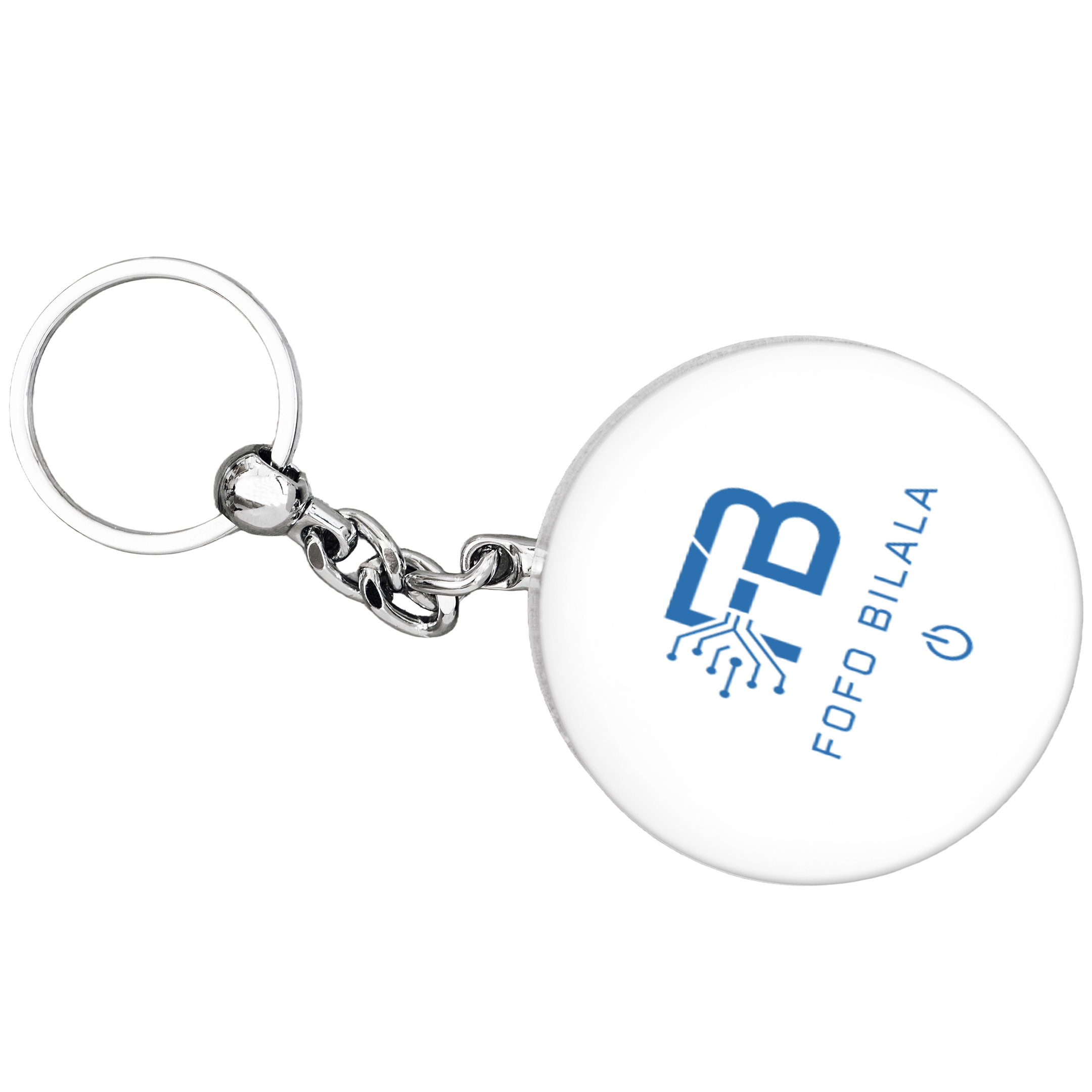
FOFO BILALA Tech
Color palette + visual tone
Direction: precision technology. Clean, confident, built to last.

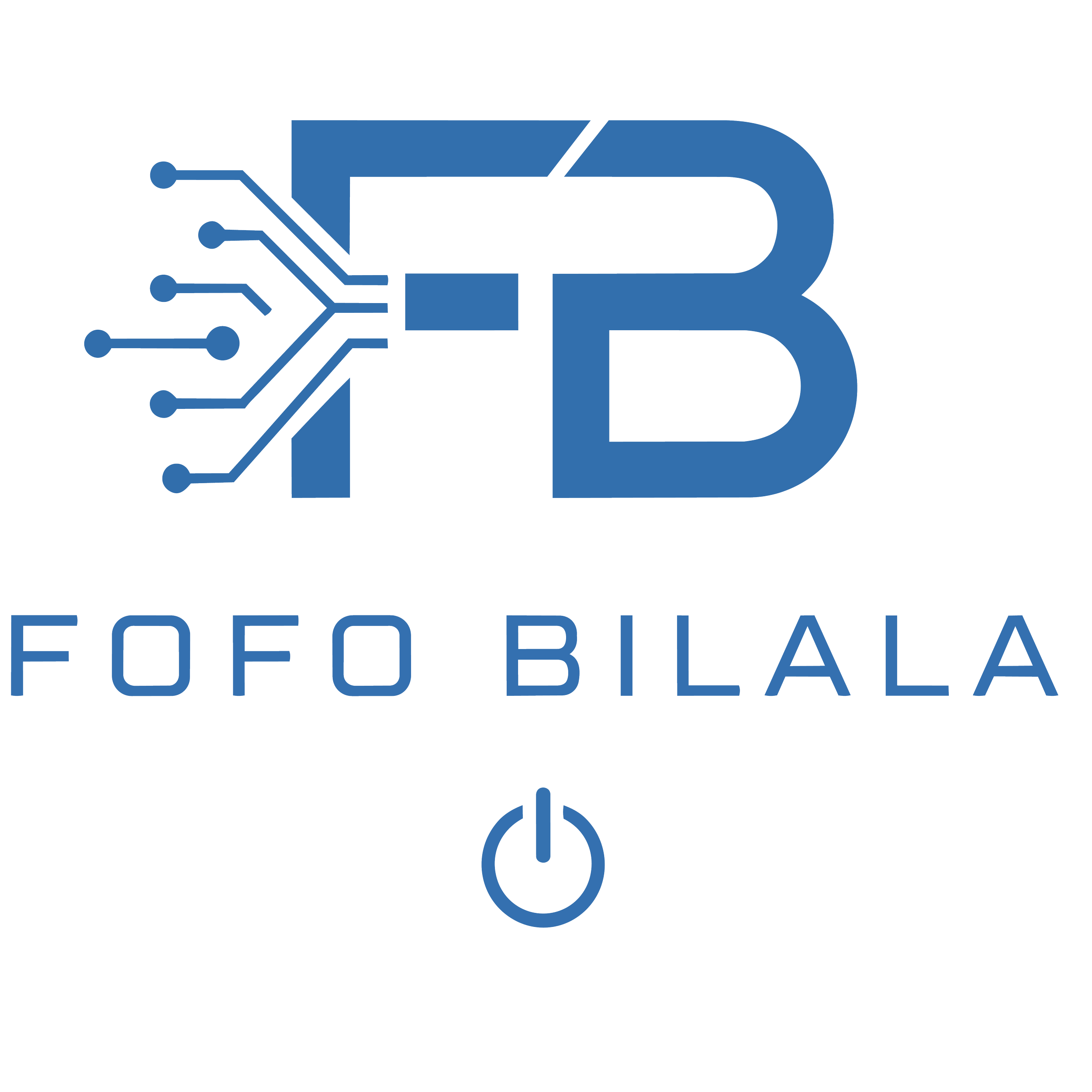
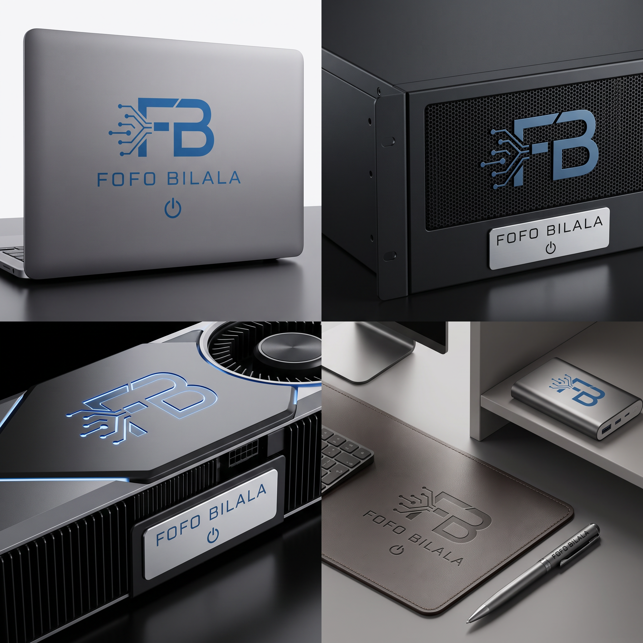
Logo
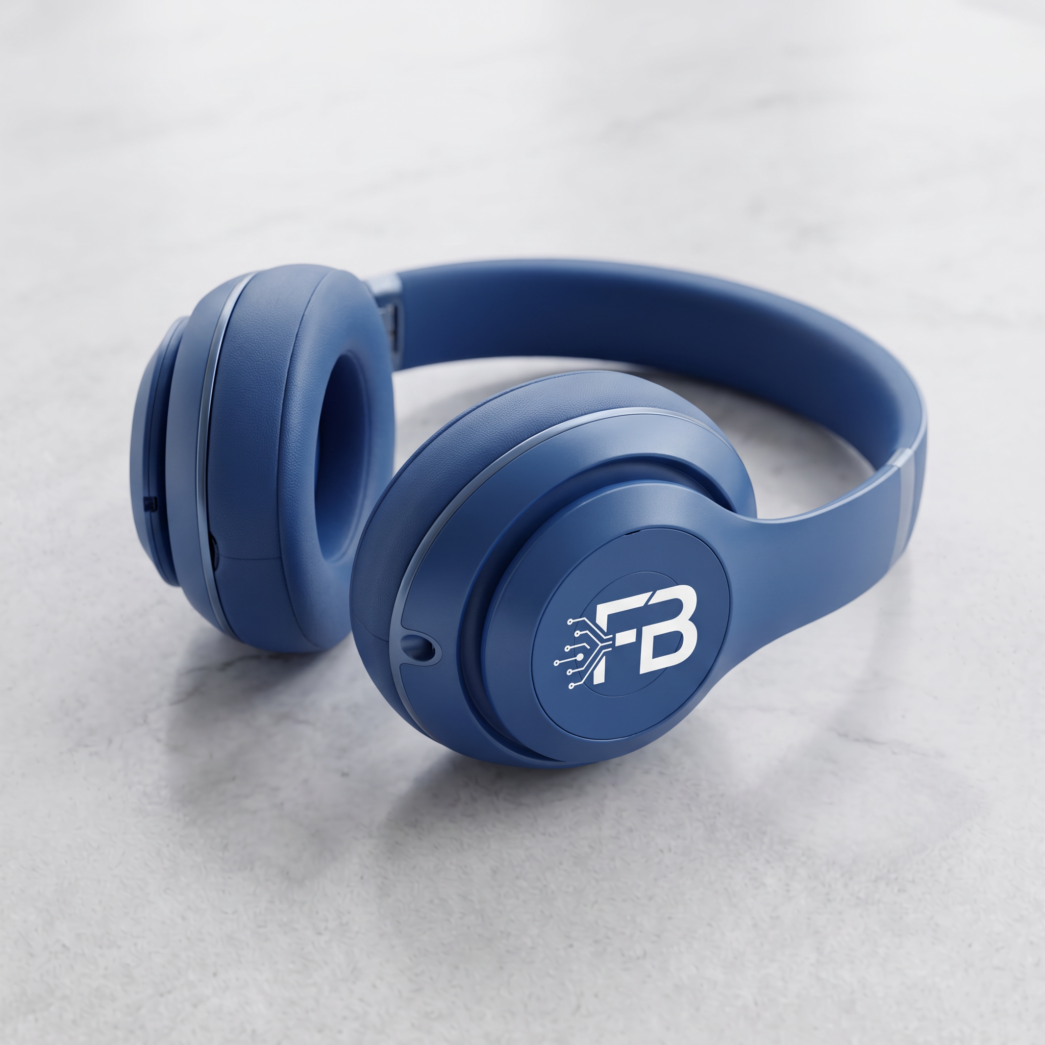
A tech company with a strong product — smart home devices and consumer electronics.
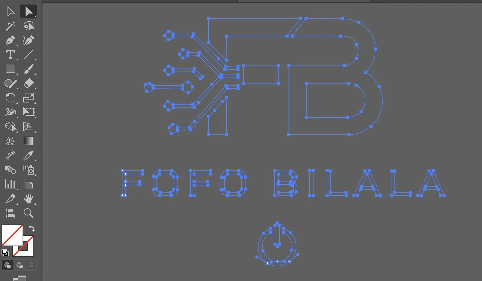

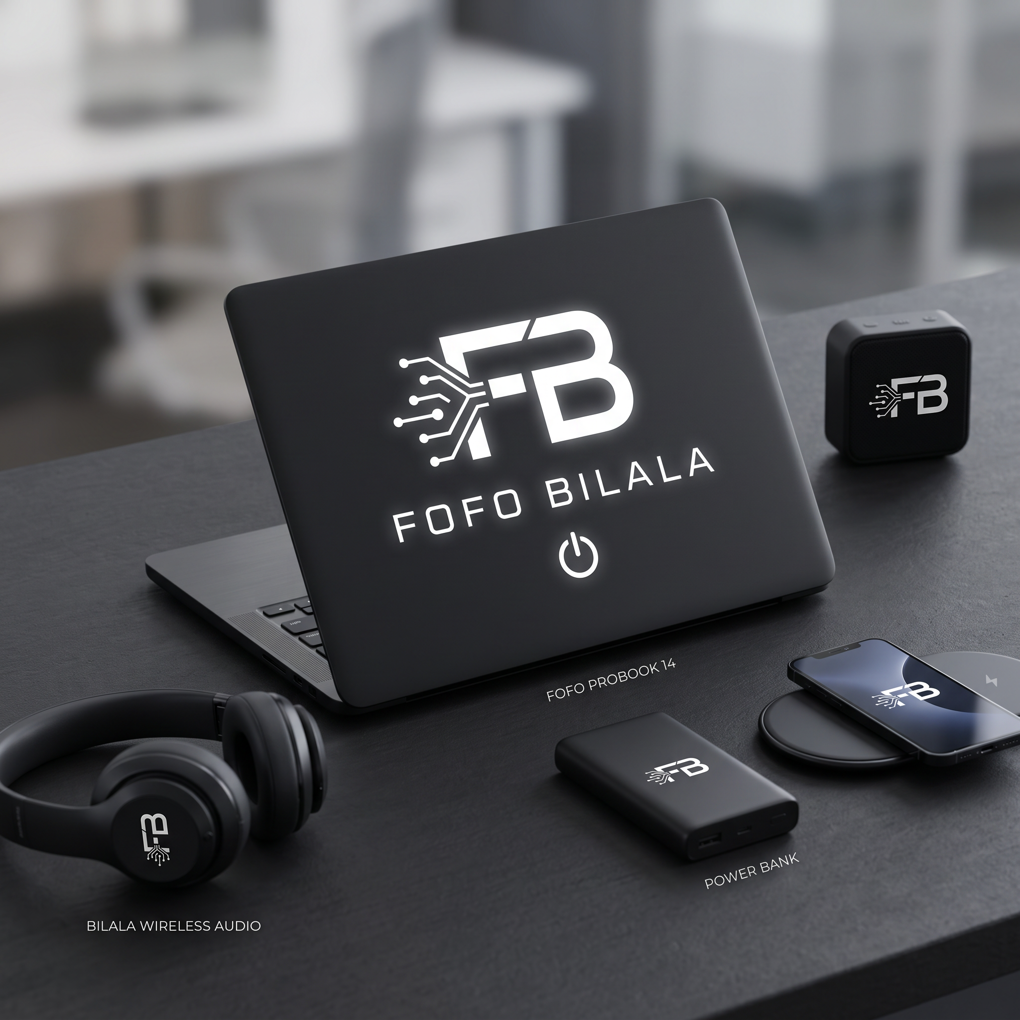
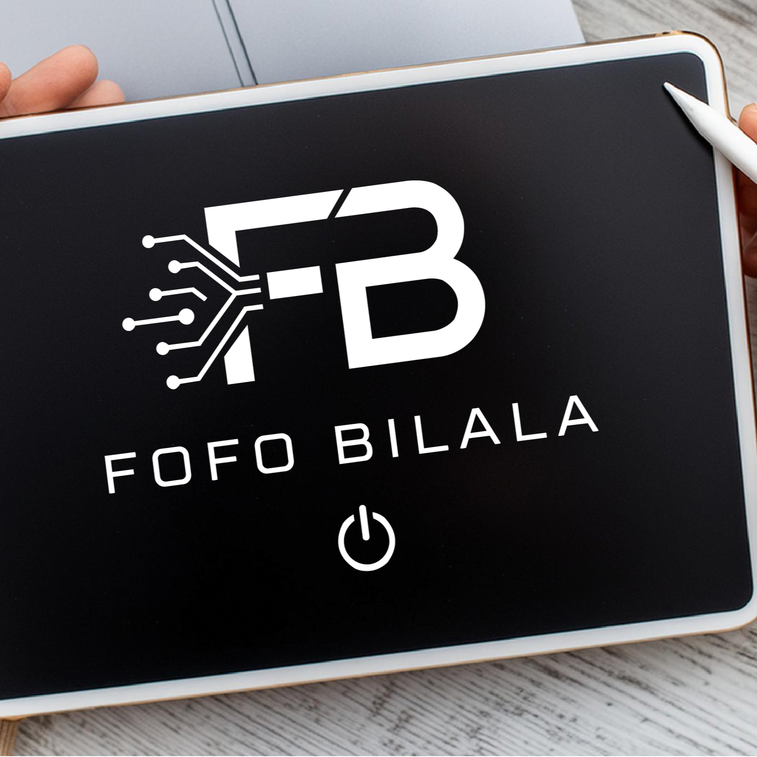
How the logo adapts across light and dark surfaces.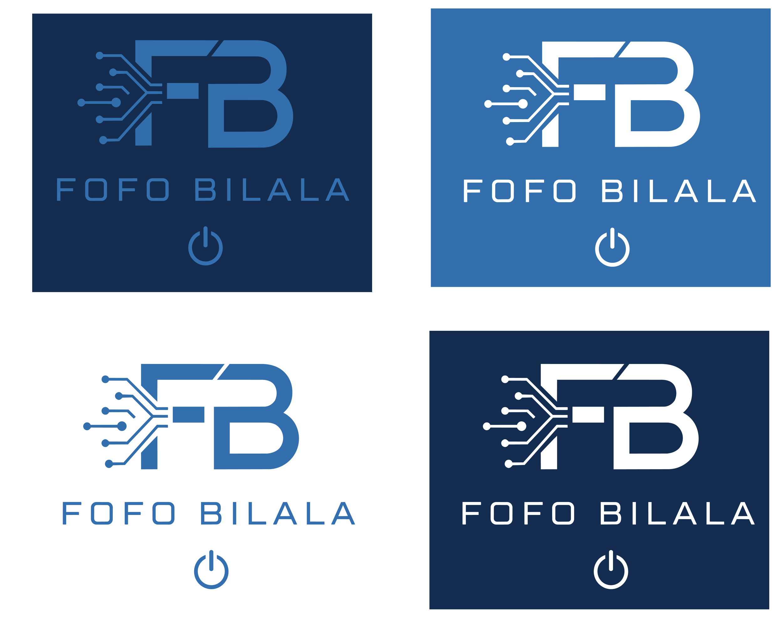

Ready to build your brand's visual identity?
Onița
Visual Identity
"The Identity System"
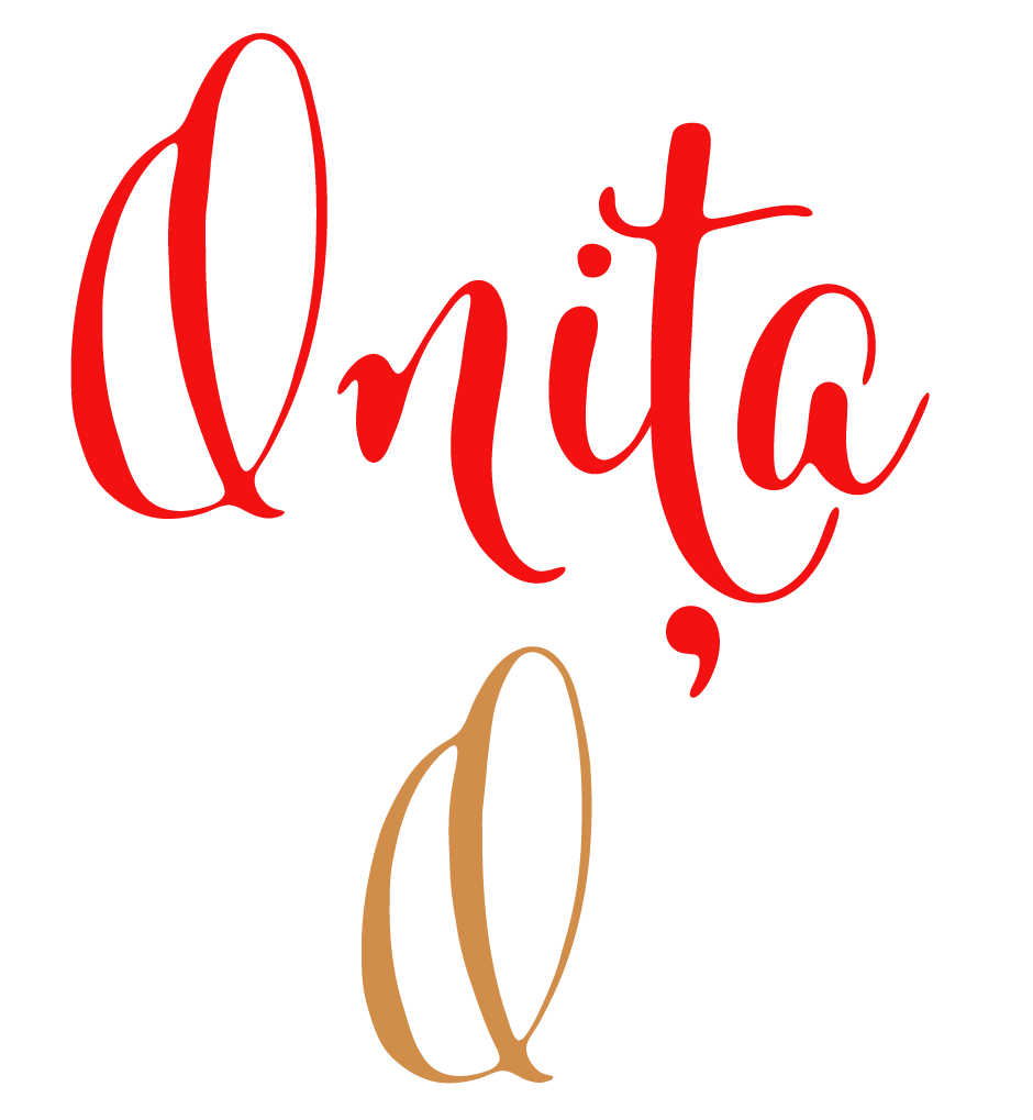
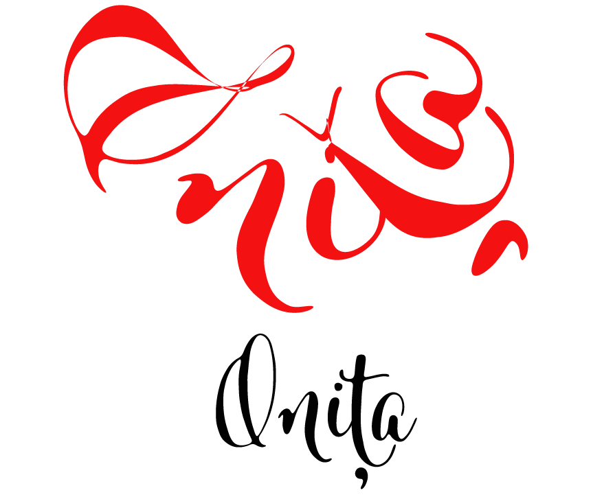
The Onița logo was developed in two variations — an elegant typographic script version and a simplified monogram (O) for smaller applications or emblems. The color palette combines deep black, intense red, and warm gold, complemented by a gradient suggesting the transition from shadow to light — a metaphor for the way a fragrance unfolds on the skin.
Concept & Inspiration
"The Starting Point"
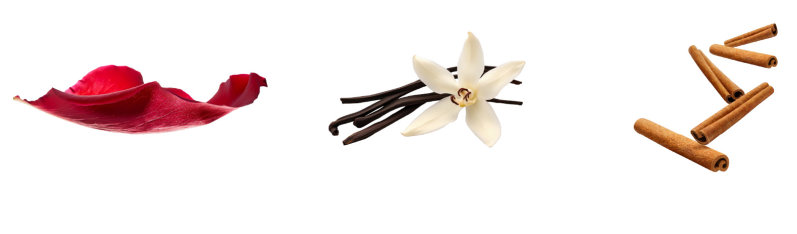
I began with a sensory palette inspired by warm, opulent ingredients — rose petals, vanilla and cinnamon. These textures and colors defined the visual direction of the entire brand: sensuality, understated luxury, and warmth.

"The Brand Pattern"
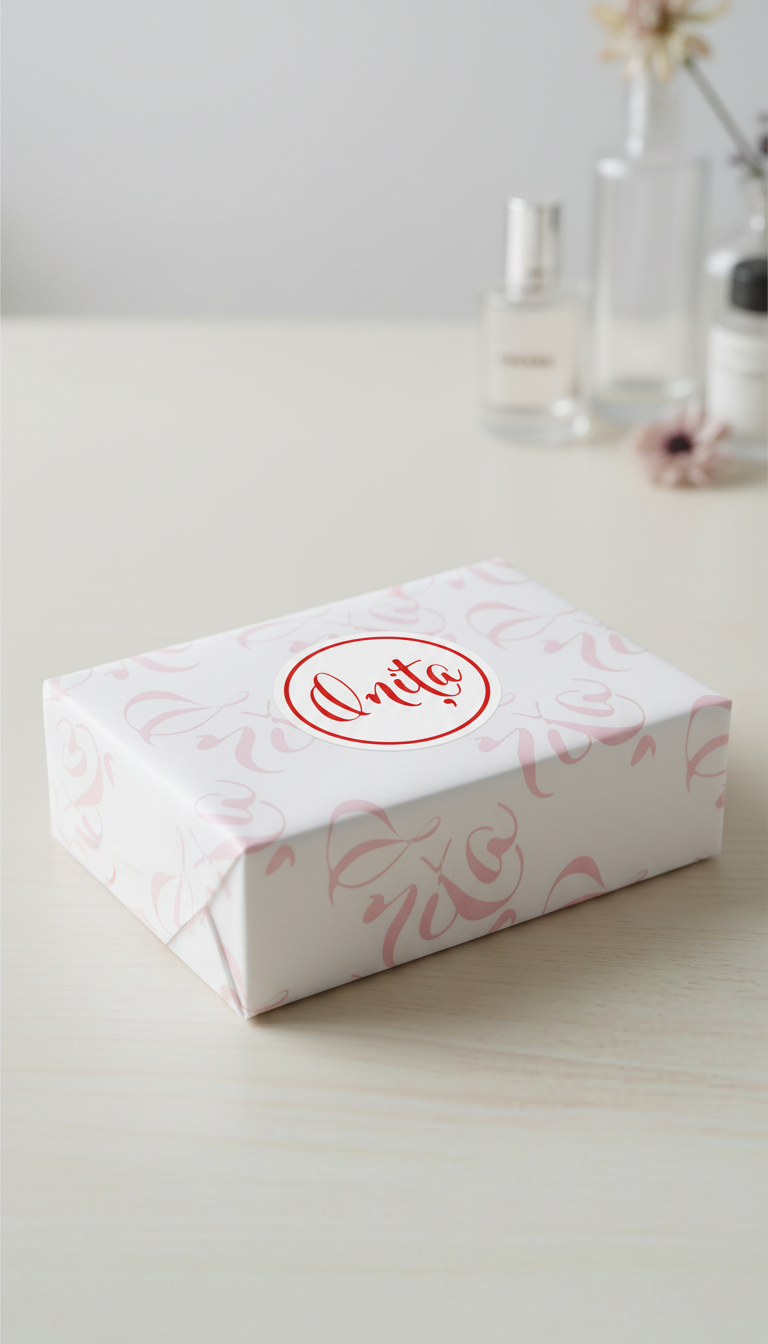
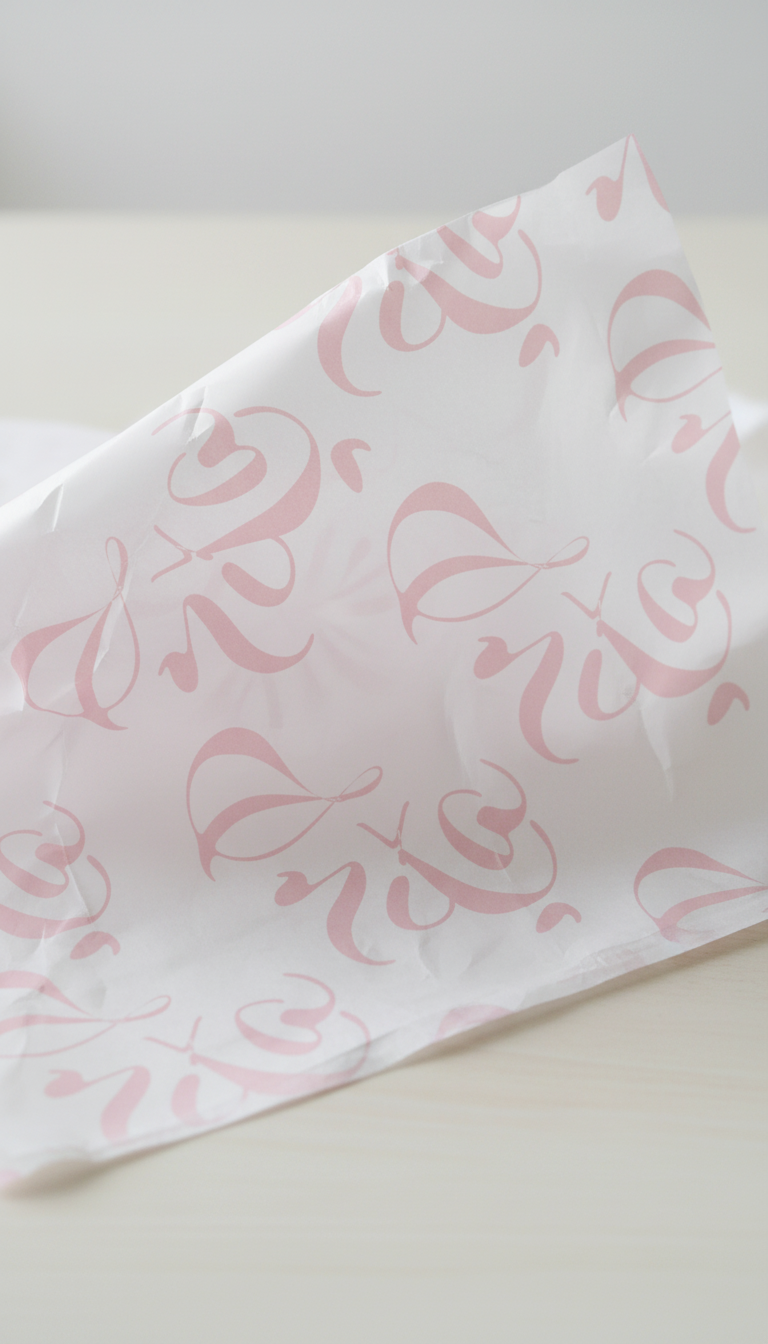
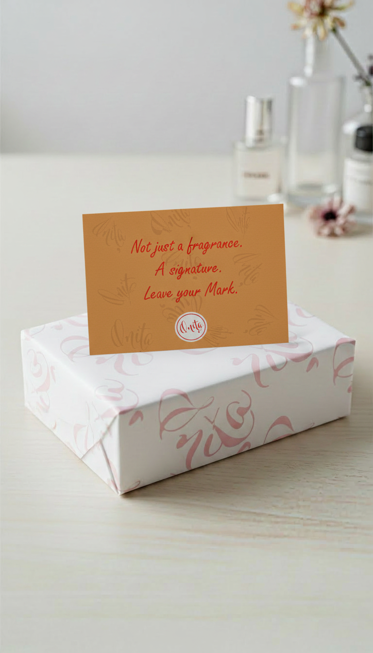
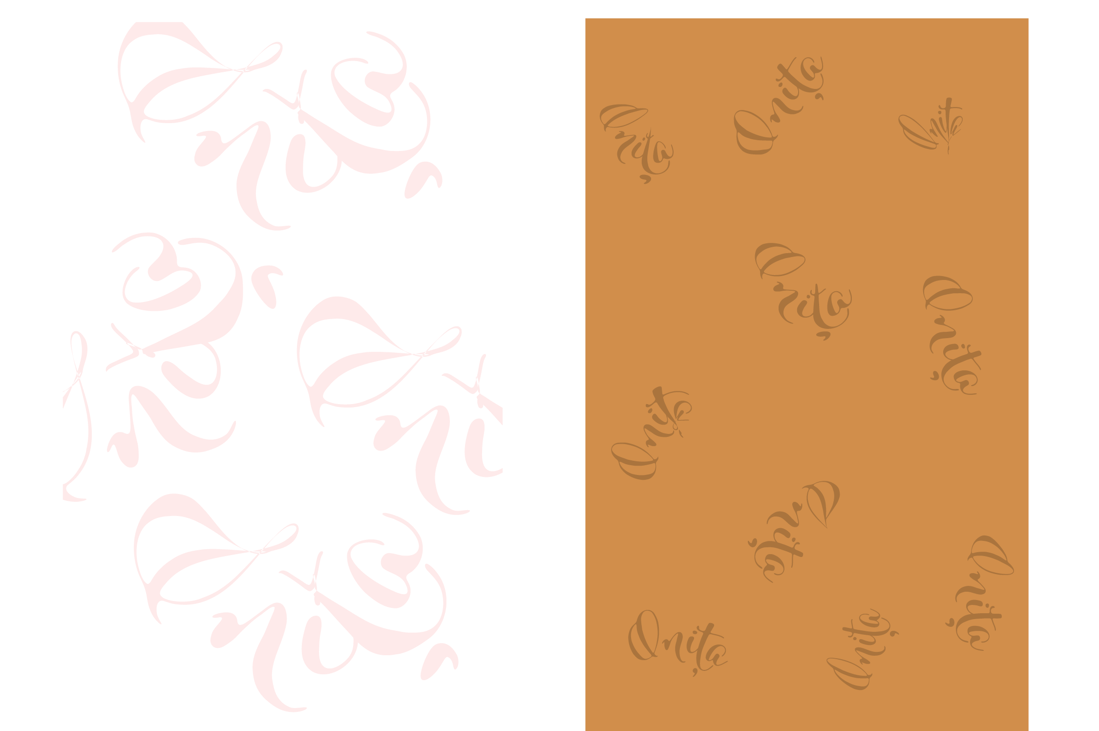
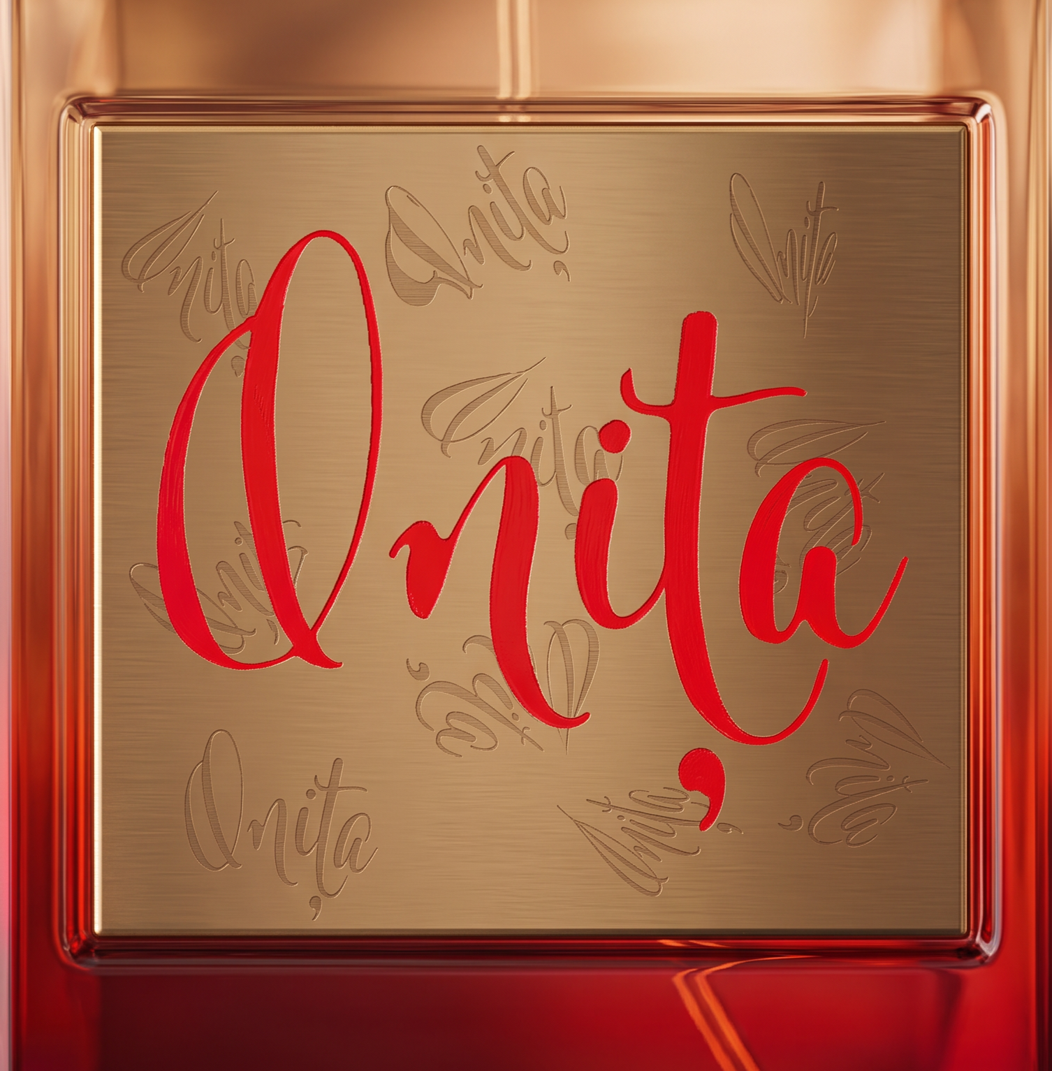
I created a decorative pattern derived from the logo, used as a unifying visual element across all materials — from the bottle label to the packaging. The subtle repetition of the calligraphic signature reinforces brand recognition without being intrusive.
"From Concept to Product"
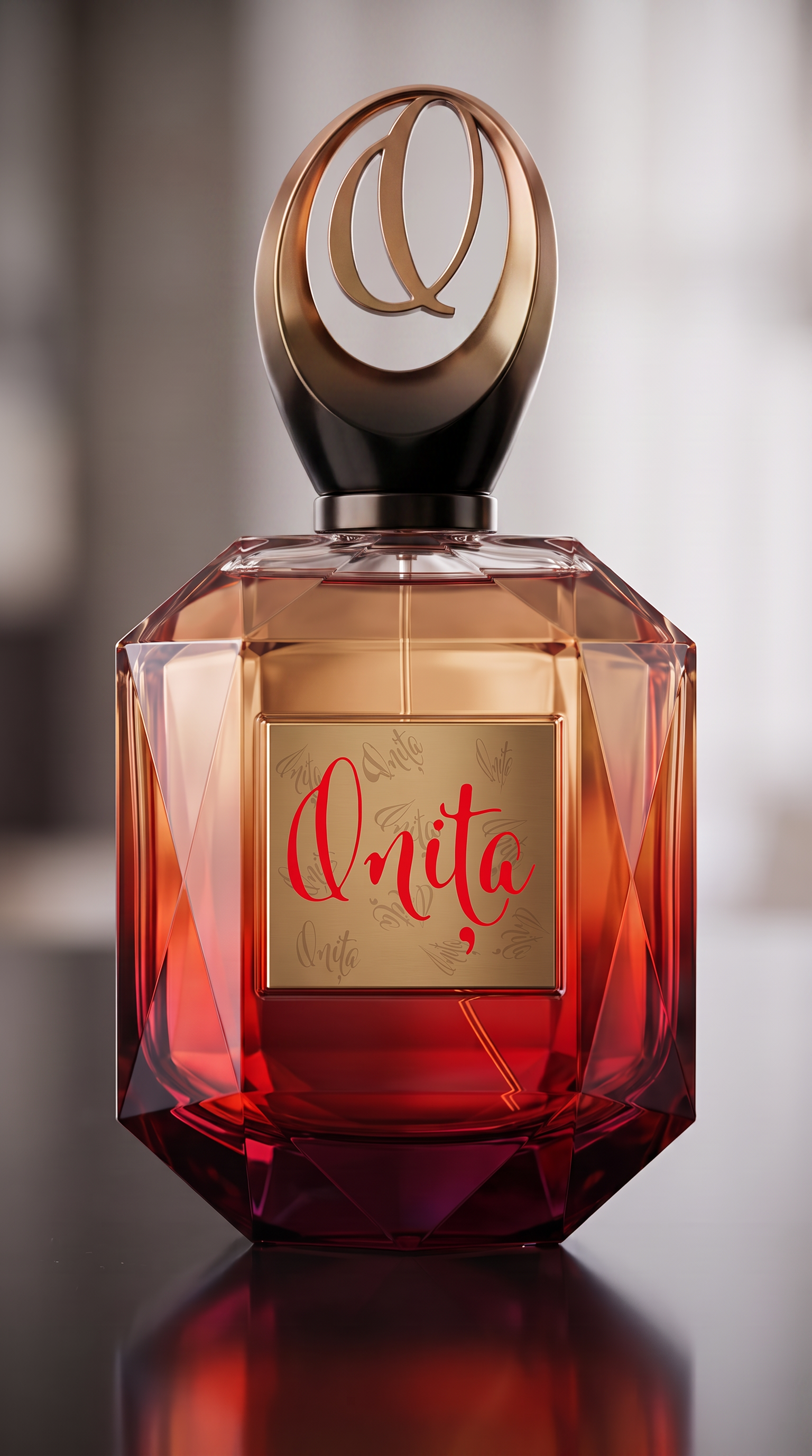
The identity was applied to the perfume bottle design, where the gold label contrasts with the colored glass, and the red calligraphy becomes the focal point. The sculptural cap, with its monogram, turns the bottle into a decorative object in its own right.

"The Unboxing Experience"
The presentation bag carries the brand's palette and pattern, maintaining visual consistency through to the point of purchase. The warm, natural kraft version and the minimalist white version offer two facets of the same brand — one organic, one refined — suited to different retail contexts.